Most finance teams do not need another chart. They need the one chart they keep rebuilding by hand every quarter, the one where somebody exports three reports into a workbook, pivots them, and pastes the result into a deck.
The Sage Intacct Interactive Visual Explorer is aimed squarely at that job. It is a visual analysis layer sitting on top of your Intacct data, letting an analyst pivot, filter and chart live financial and operational figures without writing a report definition first. It is genuinely useful. It is also, for a lot of teams, not the thing they should implement first, and nobody selling it will say that.
This is the honest version from the implementation side: what it does, the cases where a plain dashboard already covers you, the cases where the explorer earns its licence, and the cases where you should stop and buy a proper business intelligence tool instead.
Key Takeaways
- The explorer is for exploration. If you already know the question and it does not change, a dashboard tile or a saved report is cheaper to build and cheaper to keep.
- It reads the same dimensional data your reports read. It cannot slice by anything your transactions were not tagged with, so dimension design still decides the ceiling.
- The strongest case is an analyst who currently exports to a spreadsheet to answer ad hoc questions. That export habit is what the explorer replaces.
- If your real need is blending finance with payroll, CRM or operational systems, a dedicated BI platform is the right answer and the explorer is not a substitute.
- Licensing and edition availability vary. Confirm what is included in your specific contract before you build a plan around it.
Screenshots throughout are Sage Intacct product material. The figures shown in them are Sage’s demonstration data, not Lucentive client results.
What the Sage Intacct Interactive Visual Explorer actually is
The Interactive Visual Explorer is an interactive analytics surface built over your live Sage Intacct data. Rather than defining a report layout, you pick measures and dimensions and it draws the visualization, then lets you filter, drill and re-slice in place. The output can be pinned into a dashboard so others see it without rebuilding it.
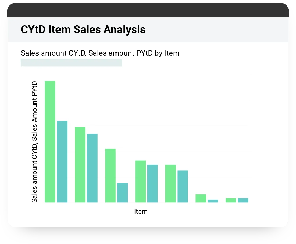
The example above is a fair representation of the sweet spot. Current year against prior year, by item, ranked. Any competent analyst can build that in a spreadsheet, and most do, roughly once a month, from an export that is stale by the time it is pasted. Building it once in the explorer means it is live and nobody rebuilds it.
Two things are worth being precise about. First, it reads your dimensional data, so what you can group by is exactly what your transactions were tagged with at entry and no more. Teams who skipped that design work find the explorer surfaces the gap rather than fixing it, which is why we push clients through our dimension design work before anyone touches analytics. Second, the visuals are prebuilt types rather than a blank canvas. That is a deliberate trade: less freedom, far less setup.
You will meet the same customer names wherever this tool is marketed. Halloran Consulting Group is one of the firms Sage names on the page this article replaces, and a logo like that tells you the product is in genuine use at a professional services business. It does not tell you whether the explorer is the right first purchase for yours.

Where a dashboard is already enough
If the question is fixed and recurring, a dashboard already answers it and the explorer adds cost without adding much. Cash position, revenue against budget, aged receivables, spend by department: these are known questions with known shapes. Build them as dashboard components once and they run themselves.
This is the most common conversation we have on this topic, and the answer disappoints people who came in wanting the newer tool. A dashboard tile is cheaper to build, cheaper to explain to a non-analyst, and considerably easier to hand over when the person who built it leaves. Our guide to Sage Intacct dashboards and reporting covers what that first build normally looks like, and for most finance teams it is the whole answer for the first two quarters after go-live.
The test we use is simple. Write the question down. If the same sentence will still be the question in six months, it is a dashboard. If the question is really a family of questions, where the answer to one determines what you ask next, that is exploration and the explorer is the right tool. Almost nobody knows which category they are in until they have run the system for a quarter, which is a good argument for waiting.
Where the visual explorer earns its place
The explorer earns its licence when somebody in your organisation is regularly exporting Sage Intacct data into a spreadsheet to answer questions that were not anticipated. That export habit is the signal. It is where the analysis is already happening, it is where the version-control problems live, and it is exactly the workflow the explorer is designed to absorb.
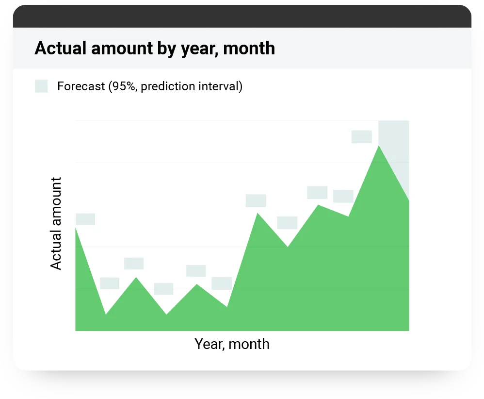
Sage markets this as instant insights and predictions. The implementer’s version is narrower and more useful: it is fast slicing of data you already own, plus a forecast overlay that extends an observed trend and draws a confidence band around it. The band is arithmetic on your history, not a view about your market, so treat it as a shape to interrogate rather than a number to commit to.
Three patterns come up repeatedly. Variance chasing, where a leader asks why a line moved and the analyst needs to cut it four different ways in one sitting. Trend and forecast work, like the chart above, where the shape of the series and a projected band matter more than the exact figure. And comparative analysis across dimensions, where the interesting finding is which location or product line behaves differently from the rest.
The narration and storytelling features fit here too, and they are more useful than they sound. Being able to annotate a visual with what it shows, and hand that to a board member rather than a bare chart, removes a meeting’s worth of explanation. It also removes the risk of a chart being read backwards by someone who was not in the analysis. That habit shift, from finance answering questions to finance publishing answers, is the same one we describe in our piece on using data proactively rather than reactively with your KPIs.
When you should use a BI tool instead
Buy a dedicated BI platform when your real question spans systems. If the analysis needs payroll, CRM, a point-of-sale system or an operational database alongside the ledger, the explorer is the wrong shape for it, because it reads Sage Intacct data. Forcing it to be your enterprise analytics layer produces a frustrating year.
Other honest signals that you have outgrown it: you need statistical modelling rather than visualization; you need to publish to hundreds of people who will never hold a Sage Intacct licence; you have a data team who already maintain a warehouse and will reasonably object to a second analytics surface with its own logic. In those cases the sensible architecture is Sage Intacct as the governed source of financial truth, feeding a warehouse, with the BI tool on top.
Many organisations run both and draw the line explicitly: anything that must tie to the audited books lives in Sage Intacct, anything blending finance with other systems lives in the BI tool. Written down, that line prevents the argument where two reports disagree and nobody can say which is right. Left unwritten, that argument arrives within a year. There is more on where the governed-source line belongs in our piece on real-time reporting and visibility.
Getting it running, and what it takes on your side
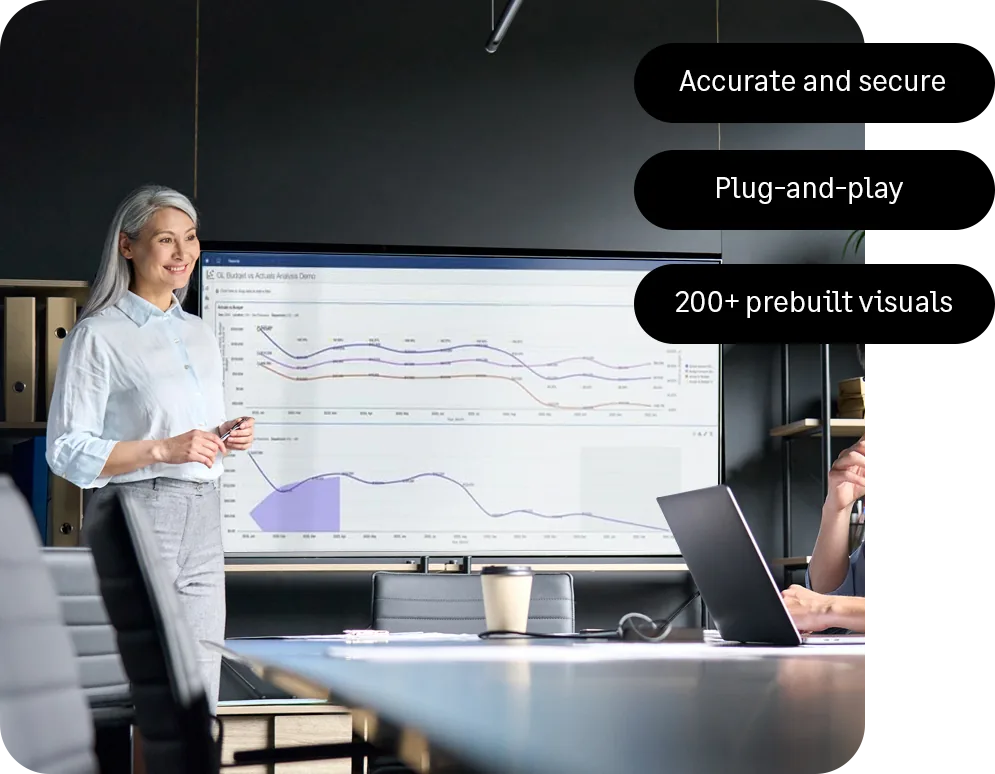
Setup is genuinely light. The explorer reads data that already exists in your Sage Intacct instance, so there is no integration project, no extract job and no separate data model to maintain. Prebuilt visual types mean an analyst produces something usable in an afternoon rather than a sprint. Plug-and-play analytics is a fair description of the mechanics.
What it takes on your side is less about setup and more about ownership. The automation and productivity gain here is real but narrow: it removes the export-and-pivot cycle for people who were already doing analysis. It does not turn a team without an analyst into a team with one. If nobody currently exports data to answer questions, the explorer will sit unused, and we would rather tell you that during scoping than at renewal.
[DATA: Lucentive’s typical timeframe from enablement to a team’s first regularly used visual explorer view — Rich to confirm]
Our practical sequencing is to leave this until after a quarter of live use. Dimensions first, core reporting second, three dashboards third, then wait. By then your team can name the three questions they keep answering by hand, and those three questions are the build list. Teams that enable analytics on day one usually build visuals against a structure that is still moving and rebuild them anyway.
Summary
The Interactive Visual Explorer is a good tool with a narrow, real job: replacing the spreadsheet export an analyst reaches for when the question is new. If that export happens weekly in your organisation, it will pay for itself quickly. If your reporting needs are known and stable, dashboards already cover you, and adding an exploration layer creates maintenance rather than insight. If your analysis genuinely spans systems, a BI platform is the honest answer and we will say so.
The way to decide is not a demo. Look at what your team exported last month and why. Bring that list to a conversation and our consultants will sort it into what a dashboard covers, what the explorer covers, and what belongs somewhere else entirely. Start that conversation with our team and we will be straight about which of the three you actually need.
Frequently Asked Questions
What is the Sage Intacct Interactive Visual Explorer?
It is an interactive analytics layer over your live Sage Intacct data. You choose measures and dimensions and it draws the visualization, which you can then filter, drill into and re-slice without defining a report first. Finished views can be pinned to dashboards so other people see them without rebuilding anything. It is designed for exploring data rather than producing statutory or statement-format reports.
How is it different from a Sage Intacct dashboard?
A dashboard answers a question you already know you will ask, every day, in the same shape. The explorer is for questions you have not asked yet, where the answer to one determines the next. Dashboards are cheaper to build and easier to hand over. The explorer is more powerful in an analyst’s hands. Most finance teams need several dashboards and one or two people with the explorer.
Can it visualize financial statements?
It can chart the underlying figures, and that is often what people actually want when they ask for financial statement visualization. It is not the right tool for producing the statement itself. Statement-format reporting, with the layout, subtotals and comparatives an auditor or board expects, belongs in the report writer. Use the report writer for the statement and the explorer for the analysis behind a line on it.
Do we need a data analyst or Python skills to use it?
No programming is involved. The visuals are prebuilt types configured through the interface, so nothing here needs Python, SQL or a data engineering background. You do need someone comfortable with pivots and reasoning about data, which is a different skill from configuring the system. In practice the person who currently builds your monthly workbook is the right person to train.
Is it included in our subscription or is it an add-on?
Availability and licensing vary by edition and by contract, and we would not want you to plan around an assumption. Check your specific agreement, or send it to us and we will confirm what your organisation is entitled to before you scope any work around it. That is a five-minute answer once someone reads the right document, and a costly surprise if nobody does.
When in an implementation should we turn it on?
Later than most people expect. Dimension design, core reporting and a small set of dashboards come first, and we normally suggest waiting a quarter after go-live before enabling analytics. By then your team can name the questions they keep answering by hand, and those questions are the build list. Enabling it early usually means building views against a structure that is still changing.